A little while ago I found myself needing to plot a heat map table in MATLAB. Such a plot is a table where the cells have background colors; the colors depend on the value in the cell, e.g. a higher value could correspond with a warmer color. I found no existing function to do this easily, so I set out to create my own solution.

A table of integers between 0 and 12. There are seven rows and seven columns. There is a color gradient ranging from black in the top left of the table dark orange in the middle, to light orange in the bottom right. The integers in the cells start at 0 in the top left and increase with every cell downward and rightward by 1. The first row describes the numbers 0, 1, 2, 3, 4, 5 and 6. The second row describes the numbers 1, 2, 3, 4, 5, 6 and 7. The last row describes numbers 6, 7, 8, 9, 10, 11 and 12. There is a legend on the right of the table ranging from 0 to 12, showing the same gradient from black to light orange.

The code to plot a heat map table can be found here.

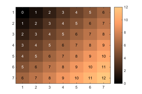
Usage is pretty simple. If you have a matrix A, just pass it into the function and it will do the rest! For example:

A = zeros(7,7);
for i = 1:7
    for j = 1:7
        A(i,j) = i+j-2;
    end
end
tabularHeatMap(A);

There are a number of options available. See the documentation in the code for more information about the options. To further adjust the generated figure, such as to add labels, proceed as you would with other plotting functions. For example:

confusion = crosstab(responses, correctAnswers);
h = tabularHeatMap(confusion, 'Colormap', 'winter');
title('Confusion Matrix');
xlabel('Correct');
ylabel('Response');
h.XAxisLocation = 'top';
h.XTick = [1 2 3];
h.XTickLabel = {'A', 'B', 'C'};
h.YTick = [1 2 3];
h.YTickLabel = {'A', 'B', 'C'};